The problem
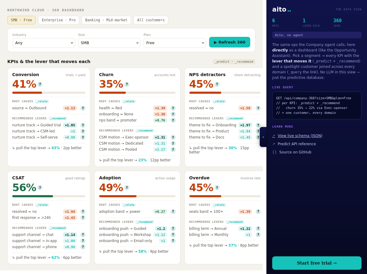
A conventional BI dashboard reports the rate and stops. Churn is 35% for Enterprise Pro accounts; the analyst still has to find out why, and what to do about it lives in a separate workshop. The diagnostic work, slicing segments, hunting drivers, guessing levers, is exactly the part that consumes analyst time, and it goes stale the moment the data moves.
The diagnosis is a statistical question the data can answer directly. What drives churn within this segment is a lift query. Which intervention most improves retention for this segment is a recommendation query. Both can run live, per segment, on every dashboard load.
How it works
Three queries per KPI. _predict gives the segment's rate with a $why behind it. _relate, scoped to the segment with $on, returns the root causes that drive the outcome within that segment rather than across the whole population. _recommend returns the lever that most moves the KPI, with the projected lift. In the live demo, six KPIs (conversion, churn, NPS, CSAT, adoption, on-time payment) render this way for any segment picked from one linked model: a customers master joined to deals, tickets, feedback, usage, and invoices. Conditioning a child table on a customer attribute traverses the link, with no join to write.
The lever's effect varies by segment, and the recommendation reflects it: an exec-sponsor motion barely moves an SMB account but strongly retains an Enterprise one. Because every number is a live query, a logged outcome sharpens the next diagnosis. There is no model to retrain and no dashboard refresh pipeline.
{
  "from": "customers",
  "relate": { "$on": [
    { "churned": "yes" },
    { "$and": [ { "size": "Enterprise" }, { "plan": "Pro" } ] }
  ] }
}
For the full architecture, see the technology overview. For the broader narrative across multiple use cases, read The Predictive Application.
See it live
This use case runs in the 🤖 Agent demo today. Click through to the live application and inspect the queries that produce the result. Source is on GitHub under Apache 2.0.
Frequently asked
How is this different from a BI dashboard with drill-downs?
Drill-downs let the analyst slice; the analyst still supplies the hypotheses. _relate returns the drivers ranked by statistical lift, so the hypotheses come from the data. The lever recommendation goes one step further: it answers "what do we do about it", which BI tooling does not attempt.
Does this need a star schema or a feature store?
No. One master table linked to child tables is enough. Conditioning a child-table query on a master attribute traverses the link inside Aito, so segment-scoped KPIs need no join pipeline and no precomputed aggregates.
Can an agent or copilot call the same diagnostics?
Yes, and the live demo shows both surfaces over the same queries: a dashboard for humans and a company agent that calls the KPI, root-cause, and lever queries as tools in chat. A SQL bot can count rows; the difference here is the optimisation step, which returns the action and its projected lift.
How fresh are the root causes when the data changes?
Every number is computed at query time from the current rows. A support ticket closed today is in the next diagnosis. There is no nightly aggregation job whose lag the analyst has to remember.