The problem
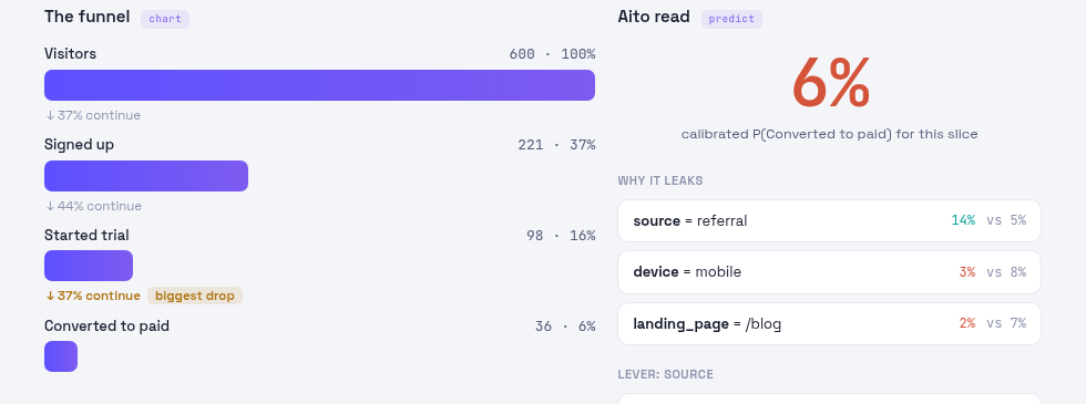
A funnel chart shows where people drop off. It does not say why, or which change would help, and the slice someone wants to look at next (mobile visitors from one campaign, say) is rarely the one the dashboard was built for.
How it works
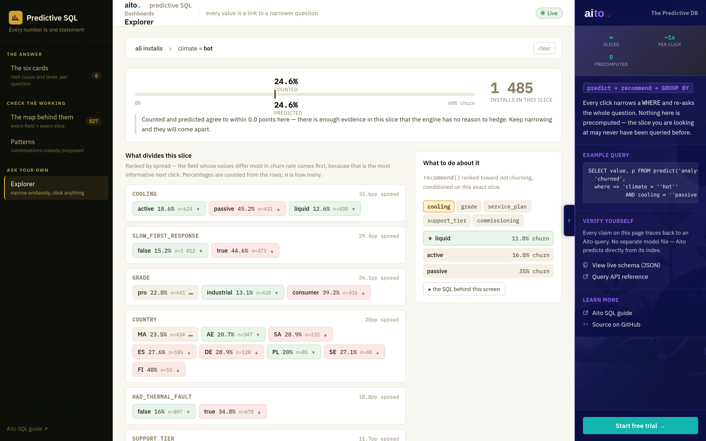
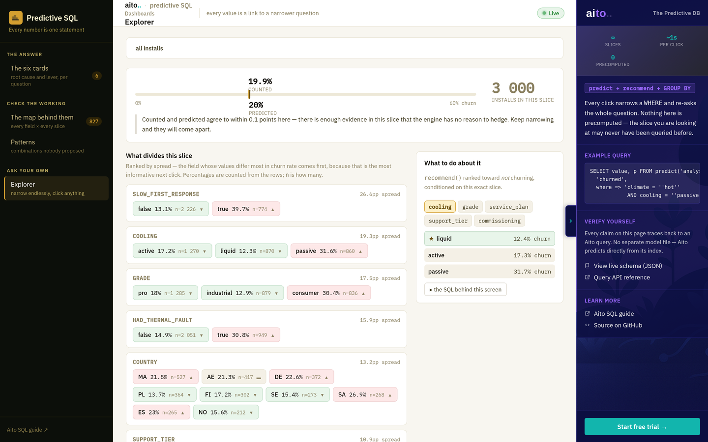
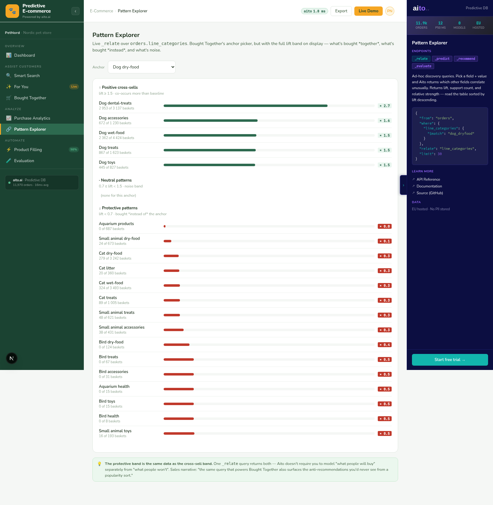
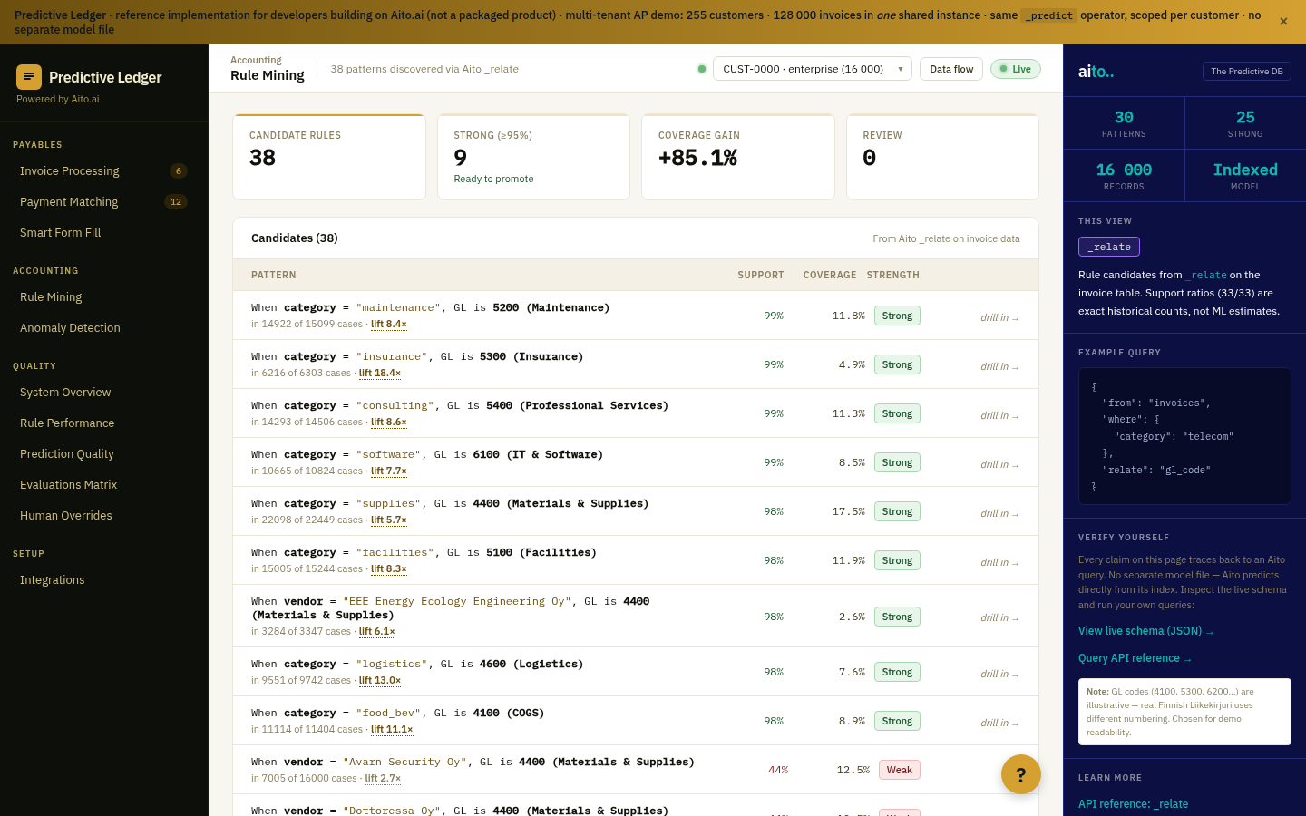
The stage counts are plain queries. For the chosen slice, _predict gives the calibrated probability of converting, _relate lists the conditions that travel with converting or not (the why-it-leaks list), and _recommend names the value of a lever, here the traffic source, most likely to lift it. Changing a filter re-asks all three; nothing is precomputed.
For the full architecture, see the technology overview. For the broader narrative across multiple use cases, read The Predictive Application.
See it live
This use case runs in Company AI, a reference application you run yourself. There is no hosted demo, so the link opens its illustrated tour and source on GitHub: Company AI tour on GitHub →