This website now listens: we are testing a consultative aito.ai

Antti Rauhala
CEO and founder
November 17, 2026 • 11 min read
Deep tech is hard to sell
Most company websites, ours included, are brochures. A visitor arrives with a question of their own: a CTO wants to know whether Aito can run in their own infrastructure, an accounting software product manager wants to see invoice automation, a developer wants the API. Still, every one of them gets the same front page in the same order, and the job of finding the relevant part is left to the visitor.
For a product like Aito, this is a real problem. Aito is deep tech: a database that answers predictive queries, with a range of use cases from GL coding to demand forecasts to search. When you try to say all of that on one page, you end up saying a little about everything and not quite enough about the thing the visitor came for. Deep tech products are notoriously difficult to sell this way, because the value only becomes clear once it is connected to the buyer's own problem.
So the site sells the way we actually sell
In practice, the only way we have ever sold Aito is consultatively. We listen first: what the customer builds, what they want to automate, and where they are with it. Only then do we show the two or three things that matter to them. It felt right to make the website work the same way.
There is also a less noble reason. Which item fits this person, given what we know about them and about everyone
before them, is precisely the kind of decision Aito is built for. It is a _recommend query. We write about
predictive applications where
every screen is a decision, and yet our own website made no decisions at all.
Here is what the site does now, and the choices we made along the way.
It asks before it shows
The first thing you see is a question, not a pitch. You pick what interests you (the technology, use cases, AI) and what kind of software you build, and the site writes a sentence for you based on those picks.
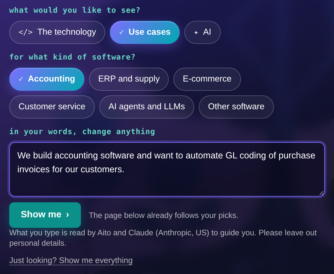
We prefilled the sentence on purpose. Writing a description of your need from scratch is hard work, while correcting a sentence that is almost right is easy. And when someone does edit it, they tell us more than any click could.
It tells you what it understood
When you press "Show me", the page answers back. It says what it understood, in plain words, and you can correct it with "Not quite?" if it got you wrong. A guide that hides its reading is a guide you cannot correct.
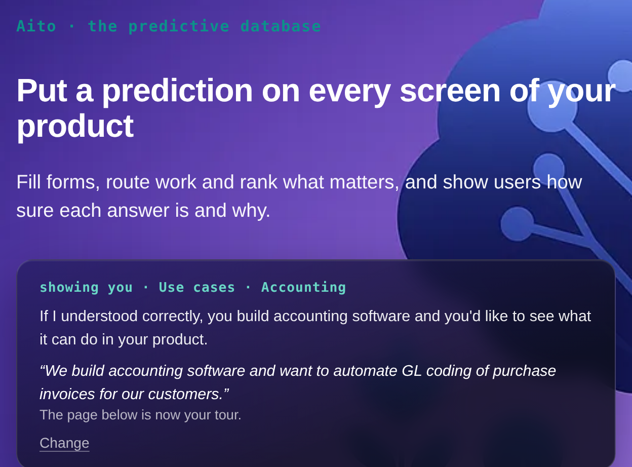
The guide uses a language model for the one thing a language model is good at here: reading your sentence and choosing between the candidates Aito gives it. The decision of what to show, and how sure we are of it, stays with Aito. This is the same division of labour we recommend to our customers in when to use Aito, and when not.
Your own words count
The sentence is where you can tell us something the buttons can't. In our first version, it didn't do much: the site read the whole sentence, and our prefilled part drowned out whatever the visitor added. You could write "we also want search and recommendations" and the page stayed the same.
Now the site reads what you wrote yourself. The guide repeats it back to you, links to the use cases, docs and pages that contain your words, and names the word it matched, so you can see why each one is there. The first card picked for you follows your words too, even when they point outside the kind of software you picked.
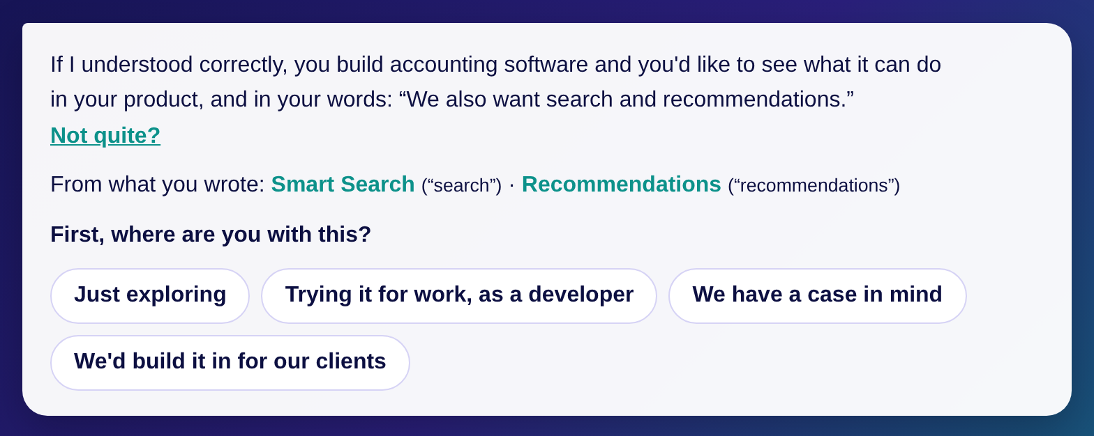
We don't store the sentence. Instead, we count whether visitors write anything at all, as a simple yes or no. If they do, the next step is to let visitors choose to keep their words, so that Aito can learn the language real buyers use rather than ours. If they don't, the box goes and the buttons stay. Either way, the data decides.
Aito picks what to show, and says why
The use cases and posts picked for you are ranked by Aito against what earlier visitors with a similar need found useful. Each pick carries its reason: a card that matches what you described says so. Now and then, the last slot deliberately shows something the ranking would not have picked, so that the ranking keeps learning instead of showing everyone the same three things forever.
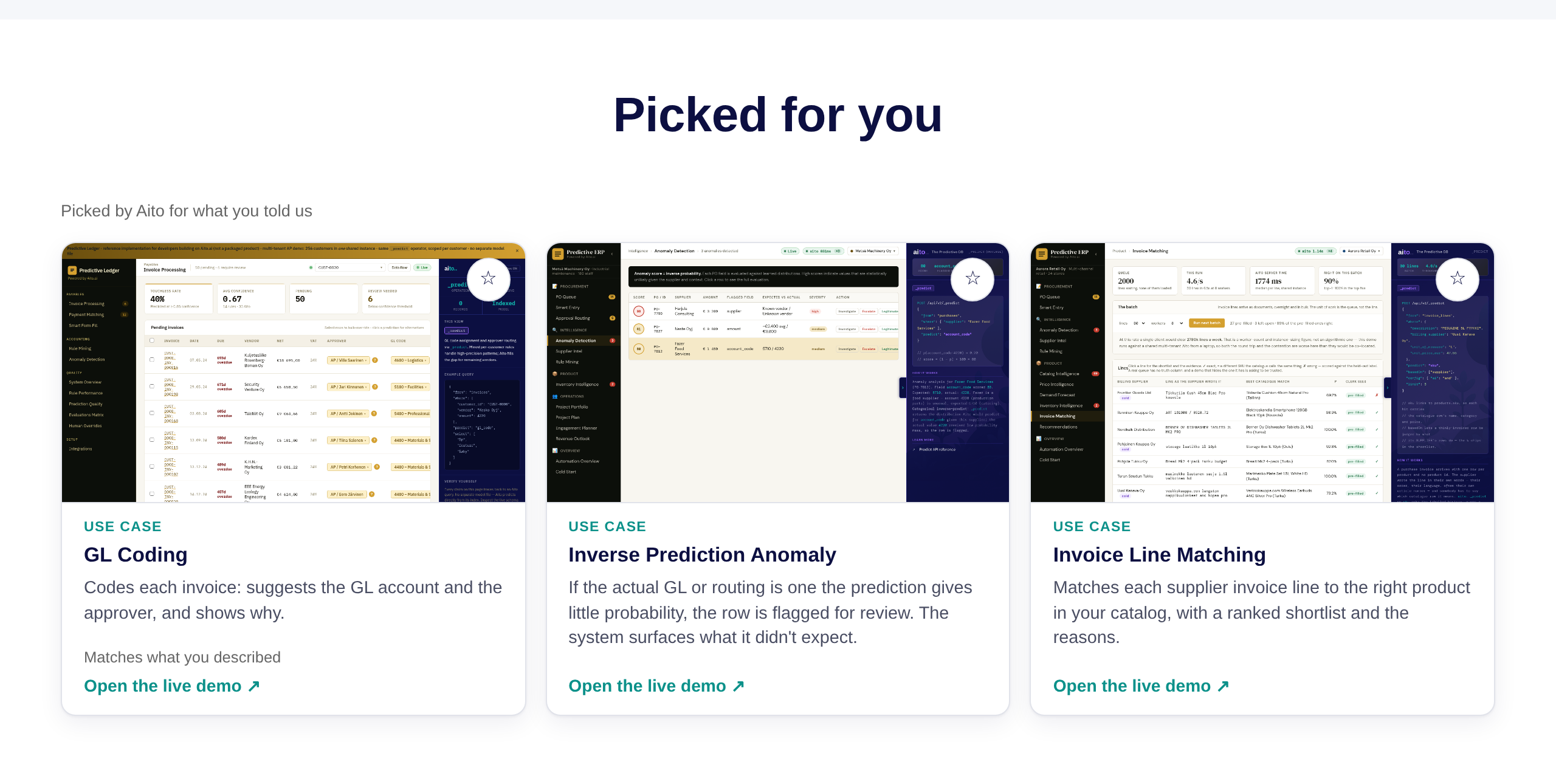
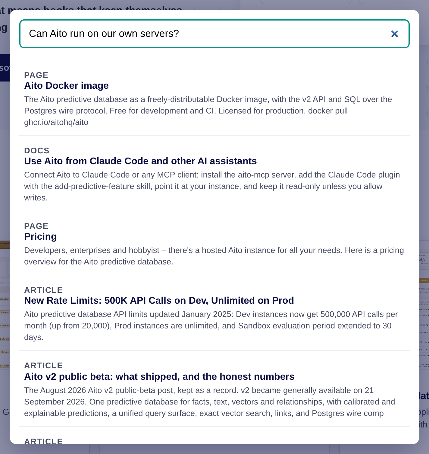
Search works the same way. Ask the site a question in your own words, and Aito ranks the pages, documents and posts that answer it, from the same knowledge base our console assistant uses.
Where you are with it, asked later
We also ask where you are with this: just exploring, trying it as a developer, a case in mind, or building it in for your clients. The answer changes the next step: the live demos for an explorer, a prompt for a coding agent for a developer, a conversation for someone with a case.
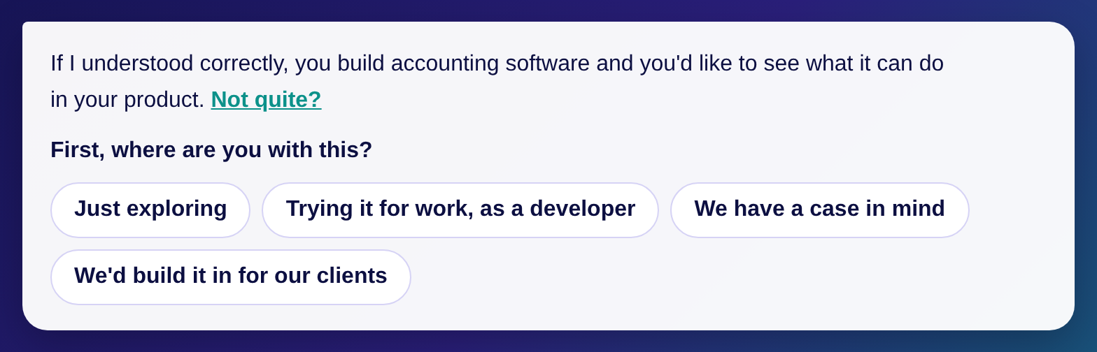
Our first version asked this right in the opening dialog, and it felt like a form. Asking where someone is with a product before they have seen any of it is a strange question, so we moved it later, into the content, where it reads as the natural next question in a conversation. We log where people answer it, so we will see whether that was right.
It ends with something you can do
A conversation that ends with "feel free to look around" hasn't really closed anything. So once the guide knows what you would like your software to do, it doesn't stop at a link: it ends with a step you can take right away. An explorer gets the live demo. Someone with a case gets 30 minutes with us, with a message already written from what they told the guide.
A developer gets a prompt. Most developers would rather try than read, and today the fastest way to try something in your own codebase is to hand it to a coding agent. So the guide writes a prompt for Claude Code, or any other coding agent, that builds the use case you picked. It tells the agent to run Aito locally from the Docker image, to read the API docs we wrote for agents and the guide for that use case, and to follow a working reference implementation from our demos.
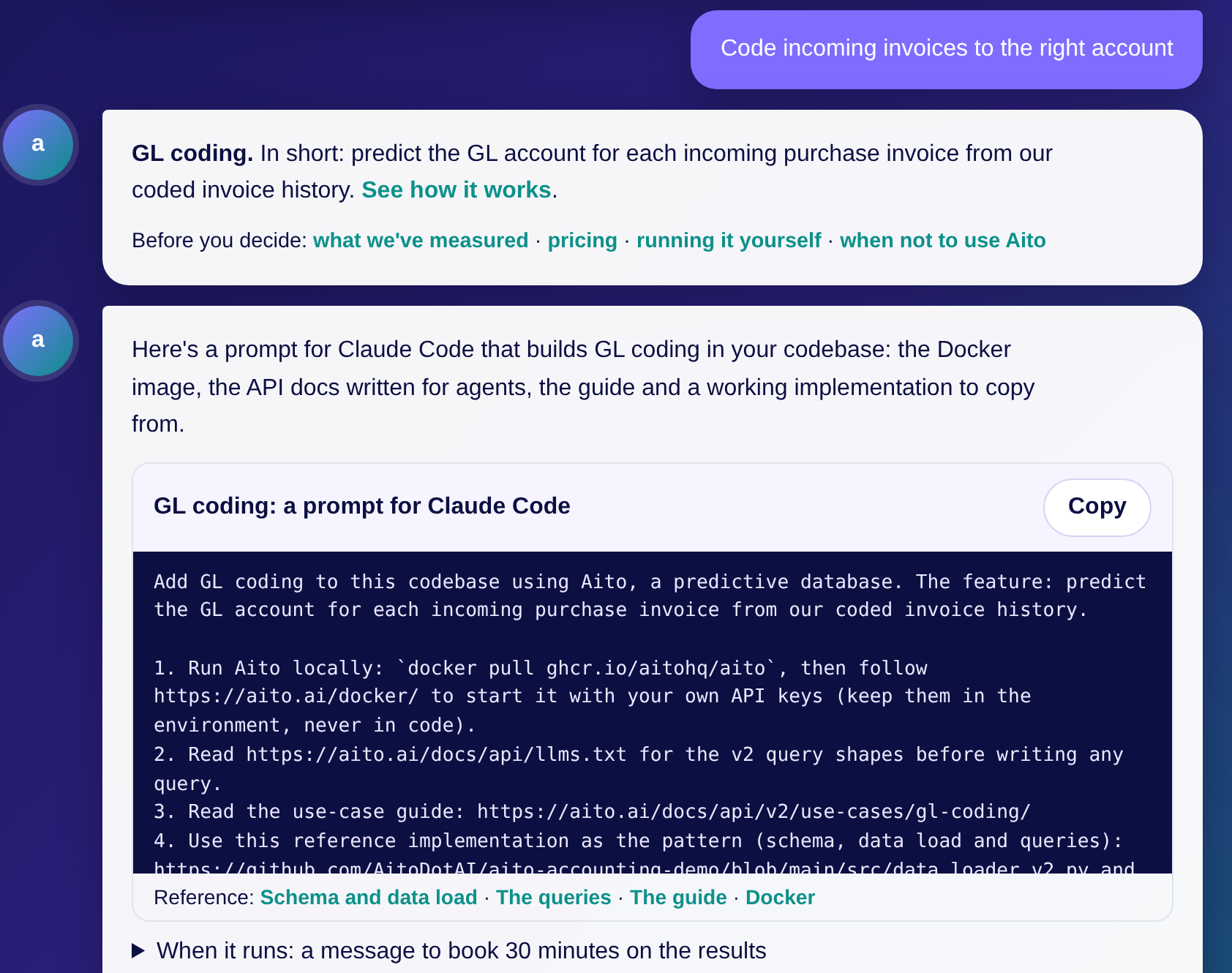
The prompt ends the way we would end it ourselves. Before wiring anything into the UI, the agent holds out recent rows, runs the predictions and reports the accuracy against how things work today. And when it does wire them in, it shows the confidence and the reasons, filling in automatically only above a threshold you choose. Right below the prompt, there is a message to book 30 minutes with us on the results, because a measured result on your own data is a much better starting point for a conversation than a brochure ever was.
The same prompts are also on the use-case pages, so you don't need the guide to get one: see, for example, purchase-order routing.
I want to understand what happens on our site
The third reason is a selfish one. I have never really understood what happens on our front page. Analytics told us how many people came and which pages they opened, but not who they were or what they were looking for, and as such it was hard to say why most of them left.
A site that asks gives us something much better than page views: the visitor's own answer to what they came for, as a handful of simple choices. We use those choices in three ways:
- for ranking, so that Aito learns which use cases and posts help which kind of visitor;
- for analytics, when you have accepted analytics cookies: which kinds of visitors read what, and which of them go on to sign up;
- for sign-ups, where the same choices travel with you, so we know which kind of visitor a sign-up came from.
Only the choices go anywhere, never what you typed. Your sentence is read to guide you, and it is not stored. And then, quite naturally, we analyse all this with Aito, the same way our customers analyse their own data: which profiles lead to which pages, and what helps the next visitor like them.
What stays the same
Quite a lot, by design:
- The page is still the page. The site is exported as static HTML with every section in it. The consultative layer runs in your browser after the page has loaded, and if our API is slow or down, you simply get the site as it was.
- Search engines see the full page. A crawler arrives with no profile, so it reads the same page a first-time visitor does.
- You can always opt out. "Just looking? Show me everything" is always there.
A good idea, but no guarantee
I think this is a good idea. It gives us three things we need:
- a personal, consultative way into a product that needs one, because deep tech doesn't sell from a brochure;
- dogfooding: our own front page runs on Aito's search and recommendations, with the same small-data problems our customers have;
- richer analytics: what kind of visitor came, what they were after, and what they did next, instead of page views alone.
That doesn't sound like a bad idea. Still, a good idea is no guarantee that it works, and there are obvious risks. A site that hides sections can hide the one you would have wanted. A guide that answers in our name can answer wrong, which is why its answers link to the page they come from. And a site that adapts is harder to reason about than a brochure: a brochure is boring, but at least everyone sees the same boring thing.
There is also a less obvious problem, and it is the one I find most interesting. A website like ours has very little data. We don't have millions of sessions to learn from, so the first rankings lean on curated starting points, and the learning has to happen from a small number of visitors. This is a problem we know well from small webshops, where most customers have ordered once or twice, but knowing a problem in a customer's data and living with it on your own front page are two different things.
On the other hand, the old site wasn't working that well either, and the cost of testing it is small: if the consultative layer doesn't help, we turn it off and the site is what it was. As such, it is something we definitely need to test.
So, will it work? I don't know yet. We'll follow the plain numbers: whether visitors find what they came for, and whether they reach the docs, the demo or a call more often than before. Once there is something to say, I'll write about what we learned: what worked, what didn't, and what it was like to build a site that decides.
In the meantime, try it. Tell it what brings you here, and if it picks badly for you, I'd like to hear about that too.
Back to blog listAddress
Episto Oy
Putouskuja 6 a 2
01600 Vantaa
Finland
VAT ID FI34337429


